Data Science for Agriculture
How to manage and manipulate data for agricultural research

This is a follow-up to R Markdown Data Analysis.
Now that you have completed your analysis, you want to visualize the analysis
for more user-friendly presentation. You decide to use the ggplot() to create
some bar graphs that will display the data.
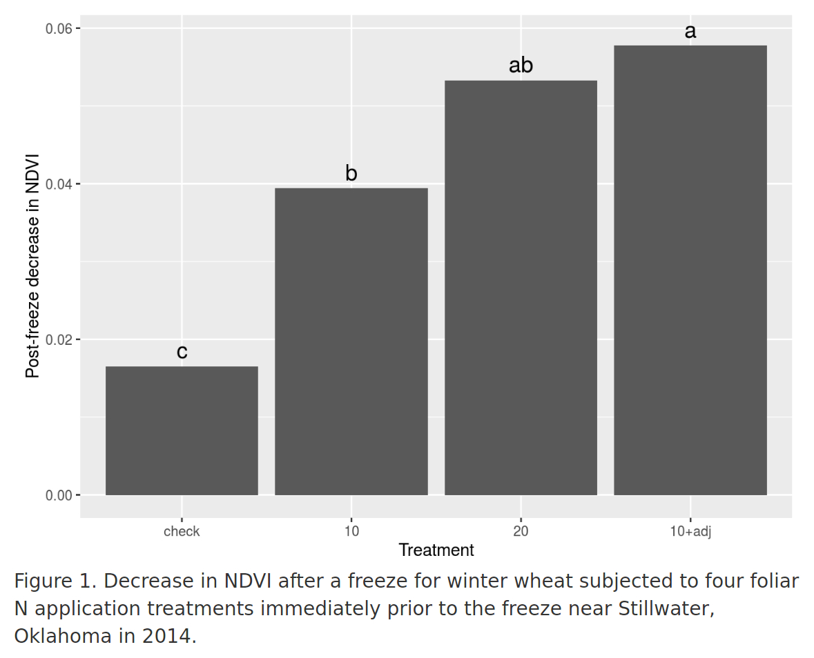
Add an R code chunk named “NDVI_plot” with the code needed to produce a barplot of the treatment means for the post-freeze NDVI decline. Be sure to label the axes appropriately.
Use geom_text() to add labels to the bars to indicate significant
differences between treatment means. Use the vjust, nudge_y, and size
arguments for geom_text() to size and position the labels appropriately.
Add a sensible caption to the figure (including a figure number) using the
fig.cap chunk option.
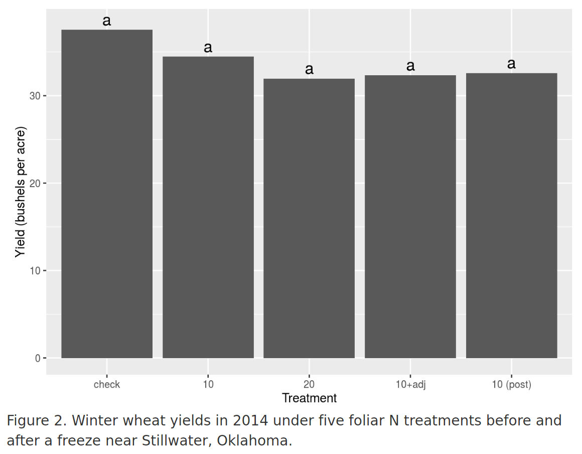
Add a new R code chunk named “yield_plot” with R code to produce an equivalent figure for the yield data. Be sure to include appropriate axis labels, bar labels for statistically significant differences, and a suitable figure caption.
Set the echo chunk option for both code chunks so that no R code is
displayed in the final output.
Add a sentence or two to your Results section describing the figures and referencing them appropriately.